May 8, 2026
Landing Page Design Tips for Paid Campaigns
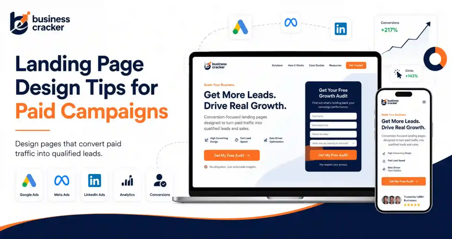
Paid campaigns do not fail only because the ads are weak. Many fail after the click.
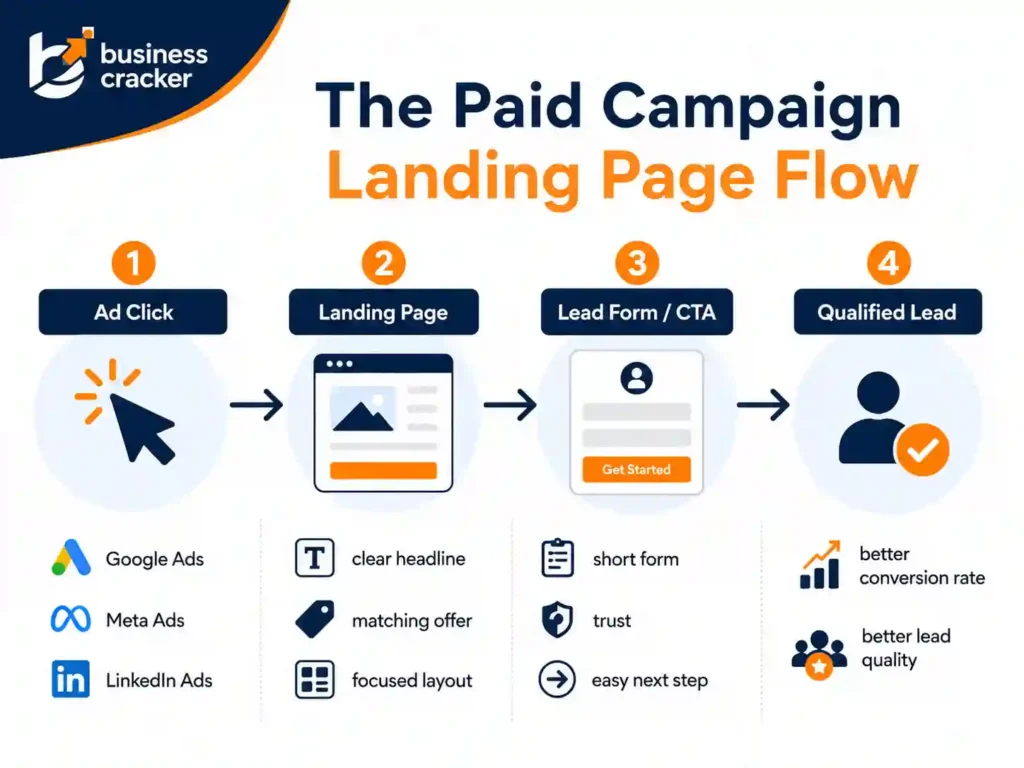
A user clicks a Google Ad, Meta Ad, LinkedIn Ad, or display ad because the message creates a clear expectation. The landing page then has one job: confirm that expectation quickly and guide the visitor toward the next action. If the page loads slowly, says something different from the ad, hides the offer, asks for too much information, or looks untrustworthy, the campaign starts wasting money.
That is why landing page design is not only a design task. It affects paid media efficiency, lead quality, conversion rate, cost per lead, and how confidently a business can scale campaigns.
Current PPC and marketing discussions show the same problems repeatedly. Advertisers are getting clicks but no conversions, B2B teams are trying to reduce wasted spend while keeping lead volume stable, and marketers are questioning whether poor campaign performance is actually caused by weak landing pages, poor tracking, bot traffic, unclear offers, or bad lead quality. In one PPC discussion, a user described getting 121 clicks and zero conversions, while responses pointed toward landing page quality, audience fit, offer clarity, and trust as likely issues.
This article explains practical landing page design tips for paid campaigns, based on how real paid traffic behaves.
The Problem This Article Solves
Many businesses treat paid campaigns and landing pages as separate work.
The ads team focuses on keywords, audiences, bidding, and creative. The design team focuses on layout. The website team focuses on building the page. The business owner checks only the final lead count.
That creates a gap.
A paid campaign landing page can look professional and still perform badly if:
- The page message does not match the ad
- The main offer is unclear
- The CTA is weak or hard to find
- The page loads slowly on mobile
- The form asks too many questions
- Trust signals are missing
- Tracking is incomplete
- The page attracts low-quality leads
- The page gives users too many choices
- The design does not support the conversion goal
This article helps marketers, business managers, SEO experts, developers, and paid media teams review landing pages before spending more ad budget.
Desired Reader Outcome
After reading this article, you should be able to:
- Review a paid campaign landing page before launch
- Identify design issues that reduce conversions
- Align ad copy, page message, and CTA
- Improve landing page optimization without guessing
- Reduce wasted paid traffic
- Decide when your business needs performance marketing services or design support
What Is a Paid Campaign Landing Page?
A paid campaign landing page is the page a user reaches after clicking an ad.
It may be used for:
- Google Ads
- Meta Ads
- LinkedIn Ads
- Microsoft Ads
- Display campaigns
- Remarketing campaigns
- Lead generation campaigns
- E-commerce campaigns
- B2B demand generation
- Service business inquiries
Google defines a landing page as the webpage where people end up after they click an ad, usually the same as the ad’s final URL.
For paid campaigns, the landing page should not behave like a generic homepage. A homepage usually has multiple paths. A landing page should have one clear conversion goal.
That goal may be:
- Submit a lead form
- Book a consultation
- Call the business
- Request a quote
- Sign up for a demo
- Download a guide
- Buy a product
- Register for a webinar
The page should be designed around that action.
Why Landing Page Design Matters for Paid Campaigns
Paid traffic has a cost. Every click spends budget.
If the landing page is weak, the business pays for visitors who do not convert.
Google Ads says landing page experience is part of ad quality and is represented by the usefulness and relevance of information on the page, ease of navigation, the number of links on the page, and whether the page meets expectations created by the ad.
Google also published a February 2025 update emphasizing the importance of relevant content and easy to navigate landing pages for search ads. Google recommended that advertisers improve navigation if their landing pages are not currently navigable.
The practical lesson is simple. A landing page is not just a place to receive traffic. It is part of the paid campaign system.
A strong landing page can help:
- Improve conversion rate
- Reduce wasted spend
- Improve lead quality
- Support Quality Score diagnostics
- Improve user trust
- Make campaign testing clearer
- Help paid traffic convert into measurable business outcomes
A weak landing page can make a good campaign look bad.
How Good Is a Normal Landing Page Conversion Rate?
There is no universal conversion rate target. Conversion rate depends on industry, offer, traffic source, audience temperature, pricing, device, brand trust, and form complexity.
Still, benchmarks are useful as a rough reference.
Unbounce’s conversion benchmark data reported a median landing page conversion rate of 6.6 percent across industries, based on analysis of 464 million visits, 41,000 unique landing pages, and 57 million conversion actions.
Do not treat 6.6 percent as your fixed target. A lead generation page for a high-ticket B2B service may convert lower but still produce strong revenue. A low-friction download page may convert much higher but produce weaker leads.
The better question is:
Is the landing page converting the right users at a cost that makes business sense?
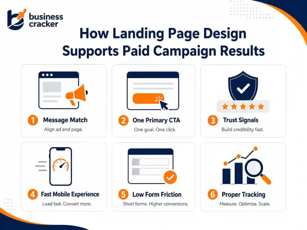
1. Match the Landing Page Message to the Ad
Message match is the first rule of paid campaign landing page design.
If the ad promises “SEO audit for small businesses,” the page should not open with a generic headline about full-service digital marketing. If the ad promotes “Google Ads management,” the landing page should not mainly talk about brand awareness.
The user clicked because of a specific promise. The page should confirm that promise immediately.
Check these elements:
- Ad headline
- Ad description
- Landing page H1
- Hero copy
- CTA text
- Offer details
- Form heading
- Page visuals
A strong landing page should make users feel they arrived in the right place.
Weak example:
Ad: “Get a paid campaign landing page audit.”
Landing page H1: “Grow Your Business Online.”
Better example:
Ad: “Get a paid campaign landing page audit.”
Landing page H1: “Landing Page Audit for Paid Campaigns.”
The second version is specific. It reduces confusion.
2. Use One Primary Goal
A paid campaign landing page should not ask users to do five things.
Do not push:
- Book a call
- Read the blog
- Watch a video
- Follow on LinkedIn
- Download a brochure
- Visit all services
- Subscribe to a newsletter
Choose one primary action.
For most service businesses, the goal is usually:
- Contact us
- Request a quote
- Book a consultation
- Submit project details
Secondary links can exist, but they should not compete with the main CTA.
A page with too many options creates hesitation. Paid traffic needs a clear path.
3. Write a Clear Above the Fold Section
The first visible section should answer four questions quickly:
- What is being offered?
- Who is it for?
- Why should the visitor care?
- What should the visitor do next?
A good above the fold section includes:
- Specific headline
- Short supporting copy
- Primary CTA
- Trust signal
- Relevant visual
- Simple form or form trigger
- No unnecessary clutter
Weak headline:
“Better Digital Growth Starts Here”
Better headline:
“Landing Page Design for Paid Campaigns That Need Better Leads”
The second headline is more useful because it tells the visitor exactly what the page is about.
4. Make the CTA Specific
Generic CTA text creates weak intent.
Avoid:
- Submit
- Click here
- Learn more
- Get started
Use CTA text that reflects the action.
Better options:
- Request a landing page review
- Get a campaign page audit
- Discuss your paid campaign
- Review my landing page
- Book a consultation
- Send project details
CTA text should reduce uncertainty. Users should know what happens after they click.
For Business Cracker, a practical CTA could be:
Need a landing page review before scaling paid ads? Contact Business Cracker for a practical page and campaign discussion.
5. Reduce Form Friction
Forms are where many paid campaign conversions are lost.
A form should ask only for information needed at that stage.
For a first inquiry, you may need:
- Name
- Phone number
- Website URL
- Service required
- Short message
You probably do not need ten fields before the first conversation.
Nielsen Norman Group’s form usability guidance recommends clear labels, proper field length, visible error messages, and avoiding unnecessary complexity in forms.
For paid campaign pages, form friction matters because every extra field can reduce completion.
Review:
- Is the form easy on mobile?
- Are labels clear?
- Are required fields reasonable?
- Does the form show errors clearly?
- Does the submit button explain the action?
- Does the thank you message confirm the next step?
A strong landing page does not only attract clicks. It makes the next step easy.
6. Build Trust Before Asking for Contact Details
Users do not share details just because a page has a form.
They need enough trust.
Trust signals may include:
- Client examples
- Case studies
- Google reviews
- Testimonials
- Industry experience
- Clear business identity
- Founder or team visibility
- Process explanation
- Contact details
- Privacy note near the form
- Certifications where relevant
- Real project examples
For service businesses, trust matters more than design polish alone.
A page asking for a consultation should explain why the business is credible. A page asking for a quote should explain what the user can expect next.
Do not make users guess whether the company is real, experienced, or reliable.
7. Keep the Page Fast on Mobile
Paid traffic is often mobile-heavy. A landing page that loads slowly can lose users before they read the offer.
Common speed problems include:
- Large hero images
- Too many scripts
- Tracking tags loaded carelessly
- Heavy page builder code
- Auto-playing videos
- Uncompressed images
- Too many fonts
- Poor hosting
- Layout shifts
- Chat widgets are loading too early
Google’s Quality Score documentation says Quality Score can help identify areas to improve ads, keywords, and landing pages, and should be treated as a diagnostic tool rather than a score to optimize blindly.
For paid campaigns, page speed should be reviewed before launch, not after the budget is already spent.
Check:
- Mobile load time
- Largest visible image
- Form loading behavior
- Third-party scripts
- Layout stability
- Tracking setup
- Core Web Vitals where relevant
Fast pages make testing cleaner because fewer users drop off due to technical friction.
8. Keep Navigation Focused
There is a common debate around whether landing pages should remove navigation completely.
The right answer depends on the campaign.
For a high-intent lead generation page, too many navigation links can distract users. For some regulated, high-trust, or complex purchases, users may need access to more information before converting.
Google’s February 2025 update emphasized relevant content and easy-to-navigate landing pages, especially when users need to move around the site to find what they want.
So, do not blindly remove every link. Instead, decide what supports the conversion.
Keep:
- Main CTA
- Privacy policy
- Contact option
- Relevant trust links if needed
- Minimal navigation for complex services
Remove or reduce:
- Generic menu clutter
- Blog links unrelated to the offer
- Social icons near the form
- Multiple service links on a single campaign page
- Anything that pulls the visitor away without purpose
A paid campaign landing page should be focused, not trapped.
9. Align the Page With Search Intent or Audience Intent
Landing pages for paid search and paid social should not always look the same.
Paid search users often have active intent. They are looking for a solution.
Paid social users may have passive or interrupted intent. They need more context.
For Google Ads, the page may need:
- Direct offer
- Clear keyword alignment
- Fast proof
- Strong CTA
- Short path to inquiry
For Meta Ads or LinkedIn Ads, the page may need:
- More explanation
- Stronger problem framing
- Better proof
- Softer CTA
- Educational angle
- Retargeting path
A single landing page can work across channels only if the audience intent is similar. Otherwise, create separate page versions.
10. Use Visual Hierarchy to Guide Attention
Design should guide the eye.
Important elements should be easy to notice:
- Headline
- Offer
- CTA
- Trust signal
- Key benefits
- Form
- Social proof
- Process
- FAQs
A cluttered landing page makes all elements compete.
Use:
- Clear spacing
- Strong section order
- Readable typography
- Consistent CTA styling
- Short sections
- Scannable bullets
- Contrast for important actions
- Relevant visuals
Avoid:
- Too many colors
- Multiple button styles
- Long text blocks
- Overloaded hero sections
- Decorative visuals that do not explain anything
- Animations that distract from the CTA
Visual hierarchy should reduce thinking effort.
11. Explain the Offer Clearly
Paid traffic does not always know your brand.
Your landing page should explain:
- What the offer includes
- Who it is for
- What problem it solves
- What happens after submission
- How long the process may take
- What the visitor needs to provide
- Why your business is a credible choice
For example, if the campaign promotes landing page design, the page should say whether the service includes:
- Page strategy
- Copywriting
- Wireframe
- Design
- Development
- Tracking setup
- A/B testing support
- Paid campaign alignment
If your offer is vague, users hesitate.
12. Add FAQs to Remove Objections
FAQs are useful on paid landing pages because they answer questions that stop users from converting.
Examples:
- How long does a landing page take to build?
- Do you design landing pages for Google Ads?
- Can you review an existing landing page?
- Do you provide tracking setup?
- Do you work with WordPress websites?
- What happens after I submit the form?
FAQs should not be filler. They should reduce objections.
For service businesses, FAQs near the bottom can improve clarity without overloading the hero section.
13. Use Social Proof Carefully
Social proof helps, but weak social proof can hurt trust.
Useful proof includes:
- Specific testimonials
- Real client logos where allowed
- Case study summaries
- Review scores
- Industry examples
- Before and after examples
- Performance improvements with context
Avoid:
- Generic praise
- Fake testimonials
- Unsupported numbers
- Overstated claims
- Stock photos pretending to be clients
If you do not have strong case studies yet, use process proof instead.
Example:
- We review ad message, page structure, CTA, form friction, tracking, and mobile experience before recommending changes.
That is more credible than an empty claim.
14. Make the Page Easy for Developers to Maintain
Landing page optimization is not only a marketing task. Software engineers and developers often need to build, maintain, or debug the page.
Developer-friendly landing pages should have:
- Clean URL structure
- Fast templates
- Clear tracking events
- Stable forms
- Accessible markup
- Proper image handling
- Minimal unused scripts
- Easy CMS editing
- No hidden SEO issues
- Working thank you page or event tracking
When developers and marketers work separately, landing pages often become slow, hard to edit, or hard to measure.
A good landing page is both conversion-focused and technically stable.
15. Track the Right Events
A paid campaign landing page without tracking is not ready.
Track:
- Form submissions
- Button clicks
- Phone clicks
- WhatsApp clicks
- Thank you page visits
- Scroll depth
- Video engagement if relevant
- Lead source
- Campaign
- Keyword or ad set
- Qualified lead status where possible
Do not stop at form submissions. A campaign can generate many leads that sales later rejects.
For B2B and service businesses, lead quality should be reviewed with sales feedback. If tracking counts spam or poor-fit leads as success, the campaign will optimize in the wrong direction.
16. Build Landing Pages for Lead Quality, Not Only Lead Volume
High lead volume is not always good.
A paid campaign page should attract the right leads and filter the wrong ones.
Ways to improve lead quality:
- State who the service is for
- Mention the service scope
- Use clear qualification questions
- Explain pricing model if appropriate
- Avoid misleading claims
- Align copy with real buyer intent
- Add industry or business type context
- Use form fields that help qualify without creating too much friction
For example, a business offering digital marketing services may want leads from businesses that need SEO, performance marketing, or website improvement, not people looking for free advice or jobs.
The landing page copy should make that clear.
17. Design for the Full Funnel
A paid campaign landing page should match the stage of the buyer.
Cold Traffic
Cold users need more education and trust.
Use:
- Problem explanation
- Simple offer
- Social proof
- Low-friction CTA
- Clear process
- FAQs
Warm Traffic
Warm users already know the problem.
Use:
- Stronger offer
- Case studies
- Service details
- Direct CTA
- Comparison points
Retargeting Traffic
Retargeting users may need a final reason to act.
Use:
- Proof
- Urgency if real
- Clear next step
- Objection handling
- Strong CTA
Do not use the same page for every funnel stage without testing.
18. Use A/B Testing Only When There Is Enough Traffic
A/B testing is useful, but not every business has enough traffic to run reliable tests.
If traffic is low, start with expert review and qualitative fixes:
- Clarify headline
- Improve CTA
- Reduce form fields
- Add trust signals
- Improve mobile layout
- Match ad message
- Fix speed issues
- Improve tracking
Once enough traffic exists, test:
- Headline
- CTA text
- Form length
- Hero layout
- Proof placement
- Offer framing
- Page length
- Trust signal order
Do not test random button colors before fixing the offer, message, and form friction.
19. Common Landing Page Mistakes in Paid Campaigns
Mistake 1: Sending Paid Traffic to the Homepage
The homepage is usually too broad. It can work for brand campaigns, but service and offer campaigns usually need dedicated landing pages.
Mistake 2: Weak Message Match
If the ad and page say different things, users lose confidence.
Mistake 3: Too Many CTAs
Multiple competing CTAs create confusion.
Mistake 4: Asking for Too Much Information
Long forms can reduce completion, especially on mobile.
Mistake 5: No Trust Signals
Users need proof before submitting details.
Mistake 6: Poor Mobile Experience
A landing page that works on desktop may fail on mobile.
Mistake 7: No Tracking Setup
Without tracking, you cannot know which campaigns, keywords, or audiences are working.
Mistake 8: Optimizing Only for Cheap Leads
Cheap leads are not always good leads. Track quality.
Mistake 9: Overdesigned Pages
Animations, sliders, and heavy visuals can distract from the offer.
Mistake 10: No Follow-Up Plan
A lead is not useful if nobody responds quickly or the sales process is unclear.
20. Landing Page Design Checklist for Paid Campaigns
Use this checklist before launching a paid campaign.
Message and Offer
- Does the page match the ad?
- Is the headline specific?
- Is the offer clear?
- Is the audience clear?
- Is the CTA relevant?
Design and UX
- Is the page easy to scan?
- Is the CTA visible?
- Is mobile layout clean?
- Is the form easy to complete?
- Are trust signals visible?
- Is there too much distraction?
Performance
- Does the page load quickly?
- Are images compressed?
- Are scripts necessary?
- Is the form stable?
- Does the page shift while loading?
Tracking
- Are conversions tracked?
- Are button clicks tracked?
- Are phone or WhatsApp clicks tracked?
- Is campaign source captured?
- Is lead quality reviewed?
Conversion Readiness
- Does the page answer key objections?
- Does it explain what happens next?
- Does it include FAQs?
- Does it support the buyer’s stage?
- Does it make contacting the business easy?
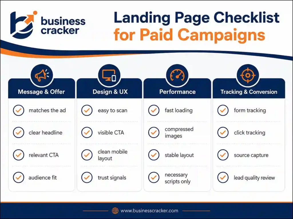
If the answer is no to several of these, fix the page before increasing ad spend.
How Business Cracker Looks at Landing Page Design
Business Cracker treats landing pages as part of the full paid marketing system, not as isolated design assets.
A paid campaign page should connect:
- Campaign message
- Audience intent
- Offer clarity
- Page speed
- Mobile usability
- Conversion tracking
- Lead quality
- Follow-up path
This is why landing page work often connects with website design services and paid campaign planning. A page should look professional, but it should also support measurable business outcomes.
Final Thoughts
Landing page design for paid campaigns is not about making a page look more attractive. It is about making the page clearer, faster, easier to trust, and easier to act on.
Before increasing ad spend, review the page that receives the traffic. Check the headline, offer, CTA, form, mobile layout, speed, trust signals, and tracking. Many campaign problems become clearer once the landing page is reviewed properly.
If your paid campaigns are getting clicks but not enough qualified leads, contact Business Cracker for a practical review of your landing page, campaign message, and conversion path.
Frequently Asked Questions
What makes a good landing page for paid campaigns?
A well-designed paid campaign landing page has a clear message, one primary CTA, fast mobile loading, strong trust signals, simple form design, proper tracking, and content that matches the ad. It should guide users toward one action without unnecessary distraction.
Should I send paid traffic to my homepage or a landing page?
For most non-brand campaigns, a dedicated landing page is better. A homepage usually has multiple paths and broad messaging. A landing page can match the ad message, focus on one offer, and guide users toward a specific conversion.
How many fields should a landing page form have?
Use only the fields needed for the first meaningful response. For many service businesses, name, email, phone, website URL, service interest, and short message may be enough. Longer forms can improve lead qualification but may reduce completion.
Why are my paid ads getting clicks but no conversions?
Common reasons include weak message match, slow page speed, unclear offer, poor mobile experience, lack of trust signals, too many CTAs, long forms, wrong audience targeting, or broken conversion tracking. Review the page before increasing budget.
How do I improve the landing page conversion rate?
Start with the basics. Match the page to the ad, clarify the headline, improve CTA text, reduce form friction, add proof, improve mobile layout, speed up the page, and check tracking. Then test larger changes once traffic volume is high enough.